
One Scorecard to Rule Them All — Why Simplicity Wins in Data
Dashboards vs Decisions
Dashboards are pretty; decisions are plain. The more monitors you open, the less the week seems to end. A scorecard is a vow to finish: a single page that tells you what you’re doing, why it matters, and whether it worked by Friday.
The Structure (Three Sections)
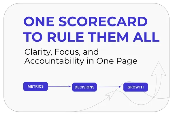
North Star — The compounding outcome your business depends on (e.g., Qualified Trials Started).
Leading Indicators — Levers you can move this week (e.g., % of leads routed correctly, % of trials to first‑aha).
Health Metrics — Guardrails that keep wins honest (e.g., refund rate, support SLA, CPL).
Anything not on the scorecard is deferred until next Monday. Simplicity is not naivety; it is operational courage.
Choosing Metrics (Be Specific)
Outcomes are behaviors measured at scale; leading indicators are the behaviors you can trigger inside seven days. If a metric cannot move by Friday, it belongs in a plan, not on the scorecard.
Good: “Trials reaching first‑aha in 24 hours.”
Mushy: “User satisfaction.”
Pick one outcome and a handful of levers. You can’t steer twelve wheels at once.
Weekly Rhythm (When Numbers Speak)
Update the scorecard once a week. Monday is for intent; Friday is for evidence. The days in between are for work. If you are refreshing graphs every hour, you’ve built entertainment, not instrumentation.
Friday demo prompt: “Show the North Star, the lever we pulled, and whether a health metric broke.”
Make It Legible (So Humans Use It)
One page (desktop or mobile).
Plain labels (no jargon).
Fixed order (North Star → Leading → Health).
Owner initial beside each lever.
Last changed timestamp and a link to the test that drove the change.
Legibility beats precision when teams are busy. You can always refine later; you cannot re‑win a lost week.
Pitfalls (and Simple Fixes)
Too many metrics. Fix: Cap at 1 outcome + 3–5 levers + 2–3 health metrics.
Vanity numbers. Fix: If it doesn’t guide a decision, delete it.
Mixed timeframes. Fix: Everything on the page should answer a Friday question.
No owner. Fix: Every lever has a name. Anonymous numbers rarely move.
A Small Story (Composite)
A growth team kept six dashboards open and still argued in meetings. They replaced them with a single scorecard. In three weeks, two things changed:
Decision speed — The Friday demo started on the scorecard, not a slide deck.
Ownership — Each lever had initials. When everything is everyone’s job, nothing happens; when it’s someone’s lever, it moves.
Revenue didn’t spike; the slope improved. That is what clarity looks like on a chart.
What to Do Next (Pick Your Path)
Open the Picker → We’ll map you to the fastest path (Book, $97 Challenge, or Toolkits).
Try the 7‑Day Challenge → Daily tasks; your $97 becomes credit toward a Toolkit.
Get the AI Business Growth Toolkit →Routers, scorecards, test matrices, and done‑for‑you blueprints.
Read the Book → A deeper dive into the weekly operating system that ships outcomes.
